Letters, Vinyl and Ghost Signs: A Shopfront Type Walk Down the Broadway
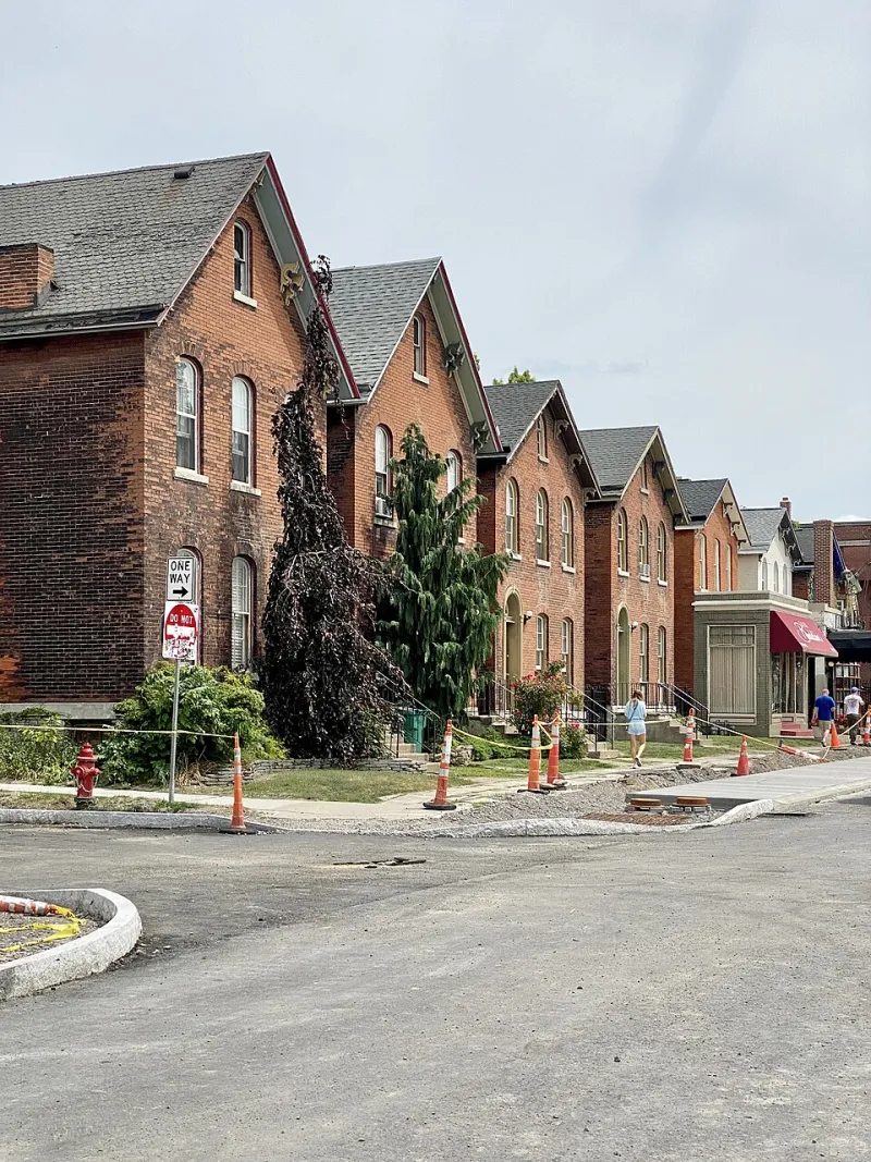
Photo: w_lemay, CC BY-SA 2.0, via Wikimedia Commons
A high street is a sentence written in shopfronts. Some of it is shouted, some whispered, some half-erased. In 2026, the Broadway is a palimpsest of hand-painted gold leaf, corporate sans-serif, vinyl decals and the faint ghosts of trades that closed decades ago. You can read the neighbourhood through its lettering — if you know where to look.
This is not a design lecture. It is a walk. Give it forty-five minutes, bring a phone camera, and resist the urge to judge too quickly. The point is not that old signs are good and new signs are bad. The point is that every fascia is a small public decision about who a shop thinks it is talking to.
Start at the top: the cinema and the corporate sans
Begin near the cinema at the top of the Broadway. Look at the main signage. It is probably clean, legible and lit from within. The type is likely a modern sans-serif, spaced with care, maybe accompanied by a logo that has been tested in a brand workshop. There is nothing wrong with this. It is competent. It is also a little forgettable.
What it tells you is that the high street is connected to national circuits. Cinemas, phone shops, estate agents and chain pharmacies do not design their signs for Muswell Hill; they design them for everywhere. The result is a kind of visual background music. You notice it when it is bad. You rarely notice it when it is fine.
The hand-painted holdouts
Walk south and look for the signs that were made by a person with a brush. They are still here. A greengrocer’s chalkboard. A hardware shop’s fascia with a shadowed serif. A café window with gold leaf lettering that catches the light at the right angle. These signs are not heritage props. They are working signs, and they carry a different message: someone here made a decision by hand.
Hand-painted lettering is never perfectly uniform. That is the point. The slight wobble in a stroke, the thickness of a downstroke, the way a letter leans — these are traces of labour. They make a shopfront feel like a place rather than a unit. In a neighbourhood that worries about losing its independent character, those traces matter.
The vinyl decade
Then there is the vinyl. Cut vinyl decals, acrylic panels, LED backlights, website addresses in small type along the bottom. This is the typography of efficiency. It is cheap to produce, easy to replace and endlessly customisable. It is also the typography of turnover. A new business can order a sign, stick it up and open within a week.
Look closely at the vinyl signs and you will see the high street’s economics. Short leases, pop-ups, seasonal shops, delivery-only brands. The type is often Arial or Montserrat, sometimes a script font used to signal ‘artisan’. None of this is a crime. But it does make the Broadway feel more temporary than it used to.
Ghost signs and half-hidden letters
Now look up. Above the modern fascias, on the brickwork, there are ghost signs: faded painted adverts for long-gone trades. Sometimes you can make out a word or a date. Sometimes it is just a shadow of a letter. These are the high street’s memory, and they are disappearing slowly under render and paint.
Ghost signs are not automatically better than new signs. They are simply older, and therefore rarer. But they do remind you that the Broadway has been rewritten many times. The shops change; the lettering changes; the neighbourhood argues about what should stay.
The A-boards and the small print
Do not ignore the pavement. A-boards, menu boards, chalkboards and temporary signs are the informal typography of the high street. They are where shops talk in a looser voice: today’s soup, this week’s offer, dog-friendly, cash only. Some are lovely. Some are clutter. Some are a trip hazard.
The council’s pavement licensing rules exist for a reason, but the A-board is also a small act of self-expression. A handwritten board can tell you more about a shop’s personality than its fascia ever will.
What the type tells us about gentrification
Here is where the walk gets sharper. Typography is not neutral. A serif font can signal heritage; a script font can signal authenticity; a minimalist sans-serif can signal that a shop is aimed at people with disposable income and a certain aesthetic. When a greengrocer becomes an artisan bakery, the lettering usually changes before the shelves do.
That does not mean every new sign is a symptom of gentrification. It means the high street is a design conversation, and not everyone has the same vocabulary. The best signs are the ones that feel like they belong — not because they are old, but because they are specific. A sign that could be anywhere is a sign that says very little.
A walking route (about 45 minutes)
- Start at the top of the Broadway near the cinema. Look at the main fascias and note the type styles. 2. Walk south along the Broadway, keeping your eyes at fascia level and then at first-floor level. 3. Turn onto Fortis Green Road and look for hand-painted details, hanging signs and A-boards. 4. Loop back via St James’s Lane and the side streets, where smaller shops often have more idiosyncratic signs. 5. Finish near the library and look back at the mix of old and new lettering.
The small choices that make a neighbourhood feel like itself
The Broadway’s typography is not just decoration. It is a public record of taste, money and change. In 2026, the high street is a mix of the hand-made and the catalogue-ordered, the faded and the freshly cut. That mix is the neighbourhood. The trick is to keep looking up, and to notice when a sign tells you something true.